My work and how I think it went
For my photography task I had to produce photographic images. This task was recreating a chosen photograph that I found interesting and liked most out of my mind mapped ideas. I found it very fun and interesting and learnt a lot during the undergoing. It gave me a lot more photography experience in both taking photos, adjusting settings as well as post production, use of online editing suites and a lot more confidence in my abilities in terms of camera my work. I think the task went down well and I got much positive feedback from my class mates and peers.
What was good about it
I think it went so well for me because I planned it properly and with a few tweaks stuck near enough to my original ideas and plans from my mind map. I feel as though the images came out near to exactly how I wanted and were all well shot, nicely focused considering lighting and angles as well as backgrounds and even clothing and shadows. I also took in skin complexion and what skin tones would've looked better for the colour correction I had to do to obtain my result. It wasn't as challenging as I thought it would've been to get the right look for my idea and to actually get that done in the editing process. The studios were available and ready to be used, the lights were already set up and the models were willing to take part on first request after I had decided who I wanted to take part. I originally had another person in mind for my idea which was a bit of a let down when they hadn't been present on the day of shooting the photos however luckily I found new subjects who in the end worked better than the original first choice. They were very professional and didn't get distracted, focused and were open to adjustment. Also I loved how they were extremely patient and didn't mind me looking around for potentially image enhancing things I could do or find around in the photography studio we were in at the time.
They were very cheerful and easy to work with which all helped the end product to be much better and overall a stronger and more favourable and desirable image. The models played a huge role in the outcome of the image and I believe the photos as well as the overall idea wouldn't have been as strong and affective had I used other models instead of the ones I chose finally.
Why it was bad
There were also negative aspects of the whole outcome and process of the build up to my end results.
I believe the main downfall to my whole project was the bad use of time planning. I could've done a lot more to meet my planned deadlines and stay up to date with my task. This made a little late in actually getting my photos done and taken, this also meant that post production editing was drawn back and this made the end product a bit more rushed than should have been. I could've maybe made it a little better had a managed my time better. So all in all the biggest issue about the task was my time management. Another negative of my work was that the model who originally was supposed to take part was a no show. This made the process of getting the photos taken much longer and meant I had to make more effort to find and decide on who I now was going to replace the original model with. Although this wasn't necessarily my own fault or doing it does come back to me and my own project. I believe if I had chosen a more reliable model my work process would have been sped up greatly as I had to wait a whole weekend to get back to college to even think of asking my replacement models to take part which again, hadn't been planned already. So not only was it a matter of unreliable models but also a matter of lack of planning in terms of a plan B and not considering that my original ideas may go wrong as unlikely as it may have seemed during the making of my plan and first draft of my ideas which should've ulitimately been the first thing I had thought to get sorted and organized. Another downfall is that during the actual production work (The actual day of the photo shoot) I couldn't quite get the lighting to hit the subject how I intended, It kept either over powering the subject and coming out over exposed on the camera or just over lighting the subject and getting rid of the all important shadows, because both models were boys, shadows were HUGELY important to adding that little bit more masculine effect which may not sound all important but the subtle change makes a huge impact on the end product of a photo, more with males subjects/models than female. Luckily the teacher was on-hand to help me sort out the lighting and eventually get the photo I had pictured in my planning stages. I think this held up the shooting and potentially could've made the shoot longer and more boring than it had to be not only for me as a photographer but for my friends as models and for my teacher as a supervisor. Also, other students were waiting to use the photography space. This unfortunately added a small amount more pressure on me and had I not been so willing to obtain my end product to the nearest to exact outcome the photos would have been a lot different and probably not been so affective.
I could've done better by sticking to my time schedules and maybe researching a manual for the lighting operations.
My feed back however was excellent and my peers really seemed to enjoy my work.
I also left productive feedback on their work and am very pleased with the feedback I recieved.
In conclusion, my project went superbly and was very productive, teaching me much more about photography and how it works. I gained plenty experience and lots of feedback and enjoyed it very much.
Vintage Life Magazine is a magazine that features practically everything that's vintage From styles and fashion, hair and beauty, house and home, to music and film, everything great about the 20s right through to the late 70s all in one magazine.
With a wide collection of experts sharing their knowledge and many featured articles each issue, Vintage Life aims to put it's reader in touch with memories past and bring them alive all over again.
It's has nearly half a million Facebook fans and nearly 40 thousand twitter followers. Subscribers are worldwide from America to new Zealand, Europe to Hong Kong.
The magazine has featured The Great Gatsby, Paloma Faith, Downton Abbey, Caro Emerald, Dita Von Teese, Breathless, Call the Midwife and Mr Selfridge to name a few.
Sunday, 8 June 2014
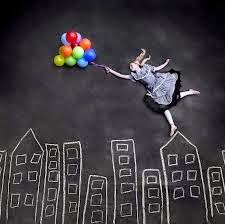
Mind map for my photography project (Sue)
.jpg)
I'd recreate it by doing the same methods used in the photo of having models lay down on a floor and get my camera up high (probably with a camera jib to get my shots.
To recreate this my idea will variate and be more around a facepaint type of art and be a standard portrait shot with a also painted (whether to blend the model to the backdrop or to make the model stand out intensely) background
example -
.jpg)
_________________________________________________________________________________

photoshopped photography - I like this idea because it has near to no limits and It's changeable in every way.
To recreate I would edit hands onto the skin of a model and embed it into the skin with photoshop as an addition overlayed layer.
.jpg)
Antique photography - I like this idea the most because of it's look, style and history. I like the colours and old age and to recreate it I would place my model in an almost school photo type position with a plain back drop and convert the image to black and white, make a new gold layer and turn down the opacity, then tweet the contrast of the photo and the opacity of the layer til correct. Maybe add a grey or white gradient layer with a gaussian blur to soften the colour or change the layer mode soften for that extra dull look.
If not this method I will do all the same but edit with colour and colour correct and enhance the gold and browns and the dull the saturation and dull the brighter colours remaining.
.jpg)
To recreate this photograph I would probably find a nice park or garden and take shots of the different colours and enhance the colour vibrancy in editing.


Eastenders screenshots (James)


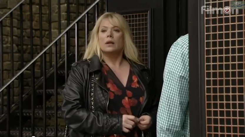


The shot changes to a long mid shot with a wide ranged angle and a larger depth of field to the last shot in the previous scene.This is to show the characters bumping into each other and shows all the hand gestures and body language more closely than the facial expression which in comparison has the same affect on the viewer and gives them insight to how the characters are feeling and what emotions they are conveying.
Everybody hates chris screen shots (James)


The Cube Screenshots (James and Barrington)

The challenge starts with a long shot through the cube's glass which I believe displays the cube's intimidation factor and belittles the challanger.

It then proceeds to a close up of the challanger gazing at the cube with a nervous look on her face, shot from the side of her fringe it hides her face making her seem more closed off from her the viewer.
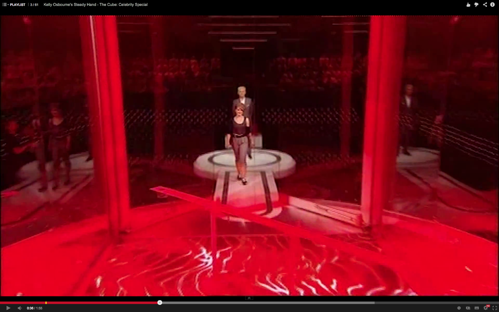
It changes to a long shot again this time a bit further out and the challenger is proceeding along to a now red and scarier, evil looking cube much bigger than her in size. This makes the audience feel helpless as to what happens now that she is to fend for herself.

It then changes to a bird's eye view, showing her pushed into a corner barely visible as though the cube had engulfed her. This is to show the sheer size of the cube to the viewer, making her challenge more entertaining as it seems harder than already imagined from the last shot to the viewer.

The cube then brightens up as though taken to a new world, still a birds eye view shot a little closer zoomed as the challenger begins the challenge.


Thursday, 5 June 2014
"Monophobia - The Fear of Being Alone" By Kameron Brown (Sue) (Video Installation)
"Monophobia - The Fear of Being Alone" By Kameron Brown.
Subscribe to:
Posts (Atom)